Monday, 8 April 2013

Visit 4 -------- Au Hoi Lam - My Father is Over the Ocean


My Father is Over the Ocean
Au Hoi Lam 


This is an exhibition for Au Hoi Lam to remembrance of her late after as well as anyone who misses their father.  Osage Open helps her to make an imaginative 'ocean' and the installation of her late father's bed and the song My Father slowly unfolds the theme of 'yearning'

"My Father, a song adapted from My Bonnie, is converted into imageries, symbols and sounds. The components of my father's bed allow me to speak to him. All of these linger in the exhibition space the 'ocean' where 365 days of yearning is embedded in. This exhibition is also dedicated to all the fathers and anyone who misses their father." Au said.


These squares with a word inside is the song of "My Father Is Over The Ocean" . The title of these artwork is  named "There is a Song (Twelve Words Twelve Months Twelve Exercise)"

I have counted that in the song. There are only 12 words in the song. Sometime the words are repeated. From the title, I know that she used a year to practice the song and spent a month for a word. What she did is to remember her father to be a filial girl.


Below are different part of the bed. She separated the bed  into different pieces. On each piece, she wrote questions on them that she wanted to ask her father (or herself). For example, how tall is Dad? What size of shoes does Dad wear? How big are Dad's hand? When did Dad and Mum meet?

She used those components of the bed to make them as an artwork because when her father died on the bed. She lied on the bed to see and feel what her father did. She saw the last scene her father saw when he was at home. She thought looking from her father's eyes, the world was never the same. 

As I seen the question on each piece of wood, I feel regret that I also do not know much about my father.
I know that he works hard for the family. However, since he spends lots of time on working, I did not have time talk with him. We did not share our happiness and sadness. What I want to say, I just want to talk with my mum and sisters. But start from now, I would like to build up a good relationship with my father. I don't want to have any regret.


Below is "Dad, What Shade of Blue and did You See Today". She used different blue colour to color the note paper with a specific pattern and  the lyrics of the song. Maybe, she thought that one of the color is the one which her father always saw.


Later, I walk in the room in the exhibition. Two speakers played the song that was sung by Au Ho Lam. The song really showed the strong sense of sadness and looked forward to see her father again. I wanted to cry at that time but I felt a little bit scared at that because there was only me in there. The atmosphere was so lonely and quiet that I could not bare.


Finally, I went out with a big cloud over my head.
Am I a filial girl to my parents? What do I feel if my parents die but I do not stay with them? Should I spend more time with them start now?


To conclude, we have to treasure what we have now.

Sunday, 7 April 2013

Visit 3 ------- Wilson Shieh... Sumbody

Wilson Shieh... Somebody


This is a show about reviewing the development of Wilson Shieh's figurative practice of the past fie years and his positioning as an artistic figure. Via the artist's work and words, fragments from Wilson's childhood, education, artistic career, and various other important influences, banal experiences and passing emotions are recalled. 


To begin with, let me talk about some of his background first. He is a Hongkonger and received education in Hong Kong also. He got 7As and 2Bs in HKCEE which was a outstanding result. Later, he studied Architecture in Hong Kong University. However, he quitted in a half year and went to study art in Chinese University of Hong Kong. His passion of art led him to be an popular artist in Hong Kong. 


Below is the picture of Anita Mui who was a super star in Hong Kong. There are 10 different dress up style in different movies. I like the one in the movie of "Rouge"(胭脂扣),which was a well-know movie at that time and I love the way she acted in the movie very much.


In this picture, two symbolize buildings are shown in the picture as dresses on the woman bodies which are Bank of China and International Finance Centre II. As we know that woman bodies are the symbol of elegance and beauty, they show that two buildings also have the same feature beautiful and elegant.


He drew 12 pictures of Chau Yun Fat with different customs in different movie scenes but with the same facial expression. They look very funny to me. As I have seen all the movie of Chau Tun Fat, I think this kind of art work is very nice to his big fans like me. I love it very much.
The picture below is the film of Cures of Golden Flower of Chau Yun Fat.


The picture below is Crouching Tiger, Hidden Dragon of Chau Yun Fat.


Many people think about death when they alive. Me as well. However, when Wilson thought about death, he liked to find some representatives to show the reason and the place that he died. He used the same body figure but with different customs to represent he was different person who died in that place.
For example, on 24 November 1991, Freddie Mercury died of bronchopneumonia  resulting form AIDS at his home Garden Ledge in Kensington of London.


These picture are the popular lyrics composer. I know them and love them as well. Wilson has the same interest as me. =]


When I saw this picture on the feel, I feel very sad that all of them are very super famous start in Hong Kong. Although they died already, their songs, movies and life spirit still live with us together. If they did not die so early, I may have more entertainment now. Love them so much. I proud of them.


After visiting Wilson... Sumbody Gallery, I think he is a real Hongkonger who has the same living style like me. We like the same movies, singers, songs and lyrics composers. It is the first time that I think all the things he made are familiar to me. All the artwork are not only an artwork but also an eyewitness of history in Hong Kong. I like the way he draws the person. Though they may have the same facial expression but different customs and environment he put in the picture can lead you to what he is thinking. This is an awesome technique that was made by him.
I appreciate what he draws and what he thinks.
I think I will follow him if he holds another exhibition again.


Visit 2 ------ANDY WARHOL Gallery


POP ART IS FOR EVERYONE
ANDY WARHOL


I went to Andy Warhol-- 15 Minutes Of Frame Exhibition. 
I really want to visit there and know more Andy Warhol due to the famous screen painting of Marilyn Monroe and the Compell's Soup Cans.

In Andy Warhol ages, he was the one who dare to use such extraordinary colors on the canvas. It was very famous in his age and many famous ask Andy Warhol to make it for them. The money for making the screen was his major part of salary.


The Campbell's Soup Can is famous for Andy Warhol because he was the first one who dare to draw our daily used thing as an artwork. He evaluated it to the art level. It is a breakthrough for art because nobody would think of drawing such a common, normal and forgettable thing as an artwork. What he did, lead the changes of trend in art. Many people admire what he thought at that time.


However, I think the most crazy thing of him was that he drew "oxidation" paintings by using his urine. I think it is very dirty. Undoubtedly, it was really a new style of painting. I should learn some of it from him.


  • To conclude, he was a popular American artist led a magnificent visual art movement -- pop art. His art works are medium accessible to people of every class and race. 


  • He coined the widely used expression "15 minutes of frame" which is very suitable for nowadays information era. 
  • He said in 1968 that "In the future, everyone will be world-famous for 15 minutes." The phenomenon is often used in reference to figures in the entertainment industry or other areas of popular culture, such as reality television and YouTube.


           I want to investigate that how he came across so much idea on making different famous art works  and his works will never get outdated. Maybe, sometimes, still can be used in the future. And I really want to get myself to change into that mindset.


    Let do something crazy like ANDY WARHOL.

    See you~

    Sunday, 24 March 2013

    Sakuran directed by Mika Ninagawa


    Sakuran 


    Story: During the 18th century the girl Kiyoha (Anna Tsuchiya) is sold into a red light district in Edo. There she learns to sing, dance and how to lead a conversation like a geisha. At first Kiyoha is of the lowest rank, but apart from her feisty nature there is also something else about her that drives men crazy. Soon she secures the favor of her suitors and concerning her rivals she can come out on top. However, she eventually hopelessly falls in love with the young man Sojiro (Hiroki Narimiya). At the same time she becomes the new oiran, the daugher of joy with the highest rank within the amusement center, and is courted by the samurai Kuranosuke (Kippei Shiina) who even wants to make her his wife. With her newly won power Kiyoha learns to bend the rules according to her will in the establishment and prefers to spend the night with poor men who have their heart in the right place rather than with rich noblemen. But she can't be happy this way and so she continuous dreaming of the day at which she can flee her life while her protector Seiji (Masanobu Ando) is holding off the most obvious harm from her.

    Review: Sakuran is a movie with visual inventiveness. It has many lush colors, which are mainly somewhere in the red and gold scale area. It tells its story in an almost pop-like fashion, or at least it's not a typical geisha drama playing in Edo.

    Director Mika Ninagawa brings the distinctive sense of color and individual view of the world with which she has rewritten the history of photography and become know around the world. With this uncompromising "Edo costume drama" she makes a glittering debut in film. Rather than a conventional "oiran tragedy", she has pursued and ageless unchanging "reality of woman", and combined this with a gentle melancholy of emotion. Spurning eye-catching effects and composites, she has relied instead on her vivid sense of color.

    Ninagawa is a top photographer but still pooled her special talent in the film that steps nimbly out of the frame work of conventional Japanese film. Sakuran is vivid and powerful, a film of the past that touches deeply into hearts that live now.


    Reference art work:

    Actually, many people in the world were inspired by the movie with lush color and contrast of red and golden. The dominating and coquettish main actress with colorful dress up in kimono made all female to rebel our origin good character. 
    Now, there is a nail tech who wants to use the theme of Sakuran with confident, gorgeous and individualize color and flower patter compromise with glitters and jewels. This kind of technique is called nail colored drawn on pottery.

    The roses drawing on the nail just like the color of the kimono which was worn by the courtesan. The black line symbolize the hair bun of woman. The lace implies the low and gentle of a woman and the glitters on the nail implies the hope of being rich and future.

    http://naileyes.pixnet.net/blog


    Reference:
    http://www.xtimeline.com/evt/view.aspx?id=130068
    http://naileyes.pixnet.net/blog
    http://www.sakuran-themovie.com/

    Tuesday, 19 February 2013

    Mika Ninagawa


    Mika Ninagawa


    Profile

    • Name Mika Ninagawa
    • Japanese: 蜷川実花
    • Birthdate: Oct. 18, 1972
    • Birthplace: Japan


    Biography:

    Mika Ninagawa is born in Tokyo. She graduated from Graphic Design department of Tama Art University in1997. She lives and works in Tokyo. Ninagawa has won numerous awards, including the Grand Prize at the "7th Photography Hitotsuboten" in 1996, the Excellence Award at "The 13th Canon New Cosmos of Photography" in 1996, "The 9th Konica Photo Encouragement Award" in 1998, and the 26th Kimura Ihei Award in 2001. In addition to her career in magazine and advertising photography, she has published richly varied books of photography and directed a film SAKURAN in 2007. She is one of the most active and successful photographers at work today. She received acclaims worldwide for her photo book Mika Ninagawa (Rizzoli N.Y., 2010). 


    Type of artwork:

    Photograph
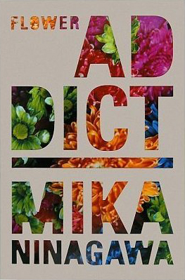
    "Flower Addict"
    It let flowers to absorb some special ink to show the human colored flower in an modern, fancy and attractive ways.


    "Noir" series

    "Even in the deepest darkness she knows colors to elicit, making her seem exuberant images a deep game play with the contrast between day and night, light and darkness, life and death. "


    Music Video
    Alicia Keys
    • "Girl on Fire (Japanese Version)" (2013)


    Film

    HELTER SKELTER 

    (ヘルタースケルター)


    Why I am interested in her:

    I know Mika when I read a Hong Kong magazine named (東touch). There is an eye-catching advertisement of a set of make up of Shu Uemura and the spokesman is the famous model named Chrissie Chau in Hong Kong. Her pretty and pure face with the colorful and fresh flower background lead me to find out who is the photographer of these pictures. And finally, I find it these were done by photographer Mika Ninagawa. 


     Advertisement of Shu Uemura                                  Model Chrissie Chau

    I like the way that she takes photos with the theme of flowers, goldfish and landscapes.  Her influence resonates with the many followers who copy her styles and mimic her stance.Her photographing technique makes everyone including me want to be shot under her camera.

    Besides, the film making by her can catch up the trend of fashion and modern. The theme is very sensitive to us and attract lots of audience to watch it. The environment under her shooting is very fantasy and beautiful that is not only a movie but also is a artwork.


    References:
    http://www.tomiokoyamagallery.com/exhibitions_en/mika-ninagawa-exhibition-plantatree-2012_en/
    http://purplekiu.mysinablog.com/index.php?op=ViewArticle&articleId=3016067


    Monday, 4 February 2013

    Visit 1------ FOTANIAN OPEN STUDIOS 2013

    Hi~ Everyone~
    It was my first time to go to an exhibition without any accompany.
    However,
    I think I could have more chances to explore something special by myself.
    And,
    start to think more.

    On 20th January, 2013,
    I went to FOTANIAN OPEN STUDIOS 2013. 
    The exhibition was quite large which covered the FoTan industrial estate.
    But this time, I only went to the main building- Wah Luen Industrial Centre to discover some of the interesting or touching masterpiece.


    This picture got my attention a lot.
    Though I did not know the title of the picture, I would like to make a title for it
    "Crying baby"
    The artist use the texture of Chinese ink painting to create a sad and  helpless facial expression.
    It shows that when we were babies. 
    We could not do all the job, simply like, when you are hungry, you cannot get milk by yourself.     

    This picture touched my heart so much.
    Because when I saw my grandmother passed away in the hospital, she definitley looked like the person in   the picture. So skinny and look pale. It made me remember  that moment. 


    Ha Ha Ha 
    I like this mail box so much. This is the most interesting one that this art can have some interactive with the audiences.
    People can take the paper from the box. On the paper, there are many love stories with number of it. Maybe up to 15. I don't know.
    I try to take as many as I can.
    But when I had already taken three of them, I felt so shine to take another one.
    Because other people were looking at me.
    Why was this girl so greedy?
    They may think like that.
    However, when I looked at the counter. I saw the one who create the box kept folding paper and filled.
    They were so busy.
     I like this picture very much. It was named "Good News".
    I understand it because. When your wings were broken, it would be good to have a bird to pretend as your wings.
    That why people love to hear "Good News".


     When I was about to leave the industrial building, I saw this funny but simple painting on the wall. It gave me a feeling like creative is very important. No matter where you are or who you are, you can use anything to make your own master piece.

    That why, I appreciate all Hong Kong Artist. Though art cannot make a lot of money in a financial centre, they still driving the rode to their destination. From this picture, you can see. The artist is helping the visitors to design the names. Keep the head down, keep the hand moving and keep our mind be creative are very important to the contemporary art.

    From now on, I think I like the way that go alone to visit the art exhibition by myself.
    I like this kind of living style.
    =]


    Bobo